id on colour properties
Colour has a unique fascination and this is no surprise, because it surrounds us everywhere. It is ubiquitous in our homes, in nature, in fashion and any media. So why do we find colour so difficult to grasp? One of the answers might just be that only 4 colour properties create a myriad of colour possibilities and even more combinations. Furthermore we all have our personal preferences and it is quite likely that no two people will agree on one colour.
Colour is my day-long obsession, joy and torment.
Claude Monet
From early mankind there was an urge to pick up a colour, or rather a pigmented stone and paint your message to the world.
Yet coming to grips with colour might be easier than you thought – just 4 colour properties – yes the very same that create so many possibilities – are the very key to unlocking the mysteries of colour.
Here is a List of the Colour Properties this Article aims to Explain:
- Tone
- Hue
- Chroma
- Temperature
1. Colour Property: Tone
Oddly enough is best to envisage tone without colour altogether.

Tone identifies the lightness or darkness of a colour
You might be familiar with the concept of a tonal drawing. This is a device that artists employ before the use of colour in order to determine the light and dark areas of an artwork. A tonal drawing or painting in turn allows the artist to judge the right tone of a colour, once the artwork progresses to a colour stage.

In colour tone it is achieved by adding
white ( Tint ) or black ( Shade ) to a colour when using opaque mediums, such as oil paint or a typical paint for painting walls.
For transparent mediums such as watercolour or ink water is added to lighten and black to darken a colour.
The ability of a colour to reflect light is a measure of tone – the more it reflects light the lighter the colour.
Well separated intervals of tone provide readability through contrast of light and dark.
Other terms for tone, that you might come across are: Value · Lightness · Greyscale
You might also want to read more on this subject here: https://en.wikipedia.org/wiki/Lightness
2. Colour Property: Hue
Hue is simply the colour in it’s unadulterated form such as red, blue, yellow.
There are three main groups of colour :
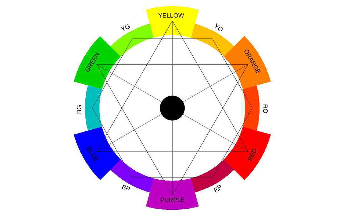
Primary: Yellow · Red · Blue – these are the most basic colours and they stand equal distance in a triangle on a colour wheel and therefore have the strongest colour contrast between each other. They are instantly recognizable.
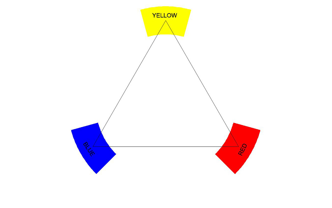
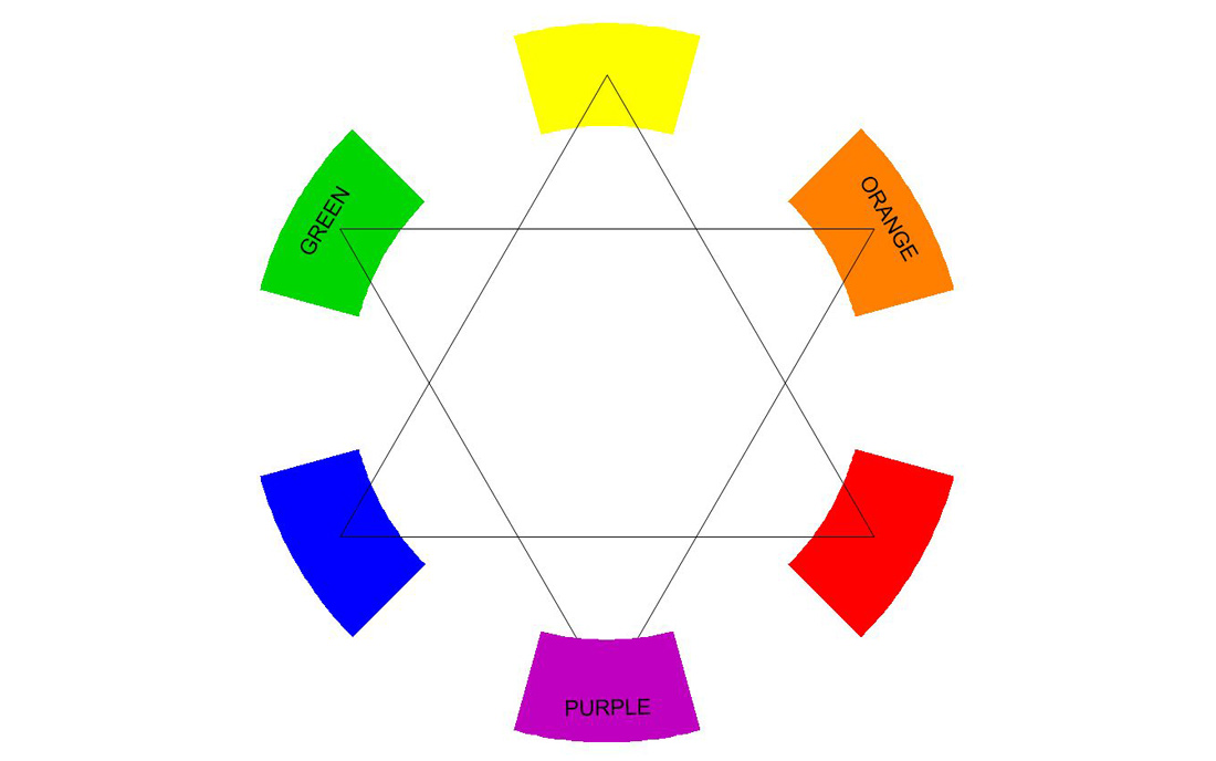
Secondary: Orange ·Purple · Green – these are mixed from the primaries- therefore Orange is mixed from yellow and red, Purple from red and blue and Green from yellow and blue. They stand between the primaries on the colour wheel and – as the primaries – in an equal distance triangle, therefore lending these colours similar contrast and recognition as the primaries.
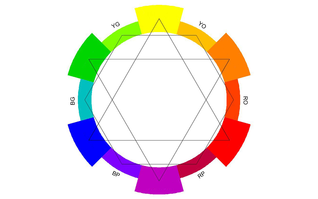
Tertiary: These colours are placed between the primary and secondary colours and are formed as a mixture of those, therefore creating 6 further colours of: Yellow Orange ·Red Orange · Red Purple · Blue Purple · Blue Green ·Yellow Green. These are closer together n the colour wheel and also less instantly recognizable, perhaps also already implied by their rather less unique naming.
3. Colour Propertiy: Chroma
This property describes the strength or weakness of a hue.
Other terms to help you picture this colour characteristic are: Brilliance · Saturation · Intensity · Purity ·Vibancy
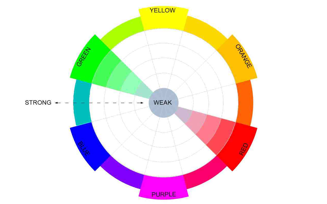
The strongest chroma colours are those on the outside of the colour wheel, therefore making primary and secondary ones strong chroma colours.

The three primary colours mixed together create black, where they meet at the centre of the wheel.
Equally mixing complementary colours, those opposed on the colour-wheel, creates black. This is best explained by mixing a primary such as blue with its complementary, which is orange – a mixture of the other two remaining primaries, therefore creating black.
4. Colour Propertiy: Temperature
Colour Temperature is the perception of warmth and coolness of a colour.
There are roughly two groups of colours on the colour-wheel are roughly divided into two groups:
Warm Colours: Yellows · Oranges · Reds
Cool Colours: Greens ·Blues · Violets
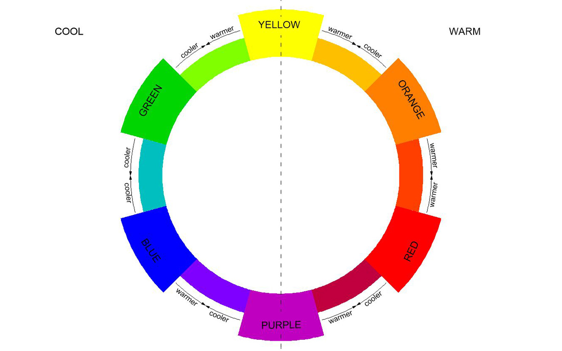
But of course, you guessed it, it is not quite that straight forward.
Each colour can be mixed with a warmer or cooler hue depending on where on the colour wheel these are.
Take yellow for example – blend yellow with orange to create a warm yellow. On the other hand, adding green to yellow will produce a cool yellow.
It then follows that a red-orange is hottest and the opposing blue-green is the coolest colour.
To Sum Up Colour Properties
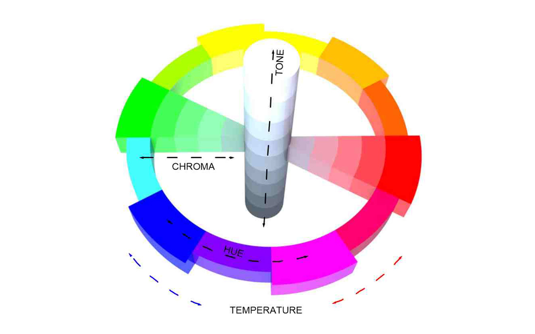
Tone, Hue, Chroma and Temperature all come together to create a multitude of colours.
I like to picture this as a colourful planet:
The equator forms a ring of the strongest hues, the poles the tonal extremes of black and white and
the closer you get to the interior the weaker the chroma, in between it is literally every colour under the sun.
In our everyday lives, colours might just make everything more enjoyable. In art and design, they are a powerful tool to shape our perception, experience and convey meaning.
You might want to read my upcoming blog s on
Please suscribe, if you would like to receive the latest.
In the meantime, with spring unfolding I hope you are inspired to take a fresh look around you
and in the words of Johann Wolfgang von Goethe:
Let the phenomena of colour speak for itself
Johann Wolfgang von Goethe

